Kyoto Journal’s “Cultural Fluidity” Issue and My Review of Honeybees and Distant Thunder

Kyoto Journal’s latest issue, “Cultural Fluidity”, is now available to download.

Overflowing with captivating content, Magda Rittenhouse‘s poignant piece on Ryuichi Sakamoto, the “godfather of electronic music”, brought tears to my eyes. Li Zizi’s Chinese flower paintings are breathtaking. There are also compelling features on jazz, punk music, and the rich history of Noh and the new “Noh”. This issue is a delight to explore. You’ll enjoy reading articles exploring Japanese emoji meanings, profound reflections on Nikkei community experiences, and haiku, as well as fantastic reviews courtesy of Patrick McCoy, Leanne Ogasawara, Kala Ramesh, David Cozy, and other esteemed writers. Trust me, this issue is a must-read gem.

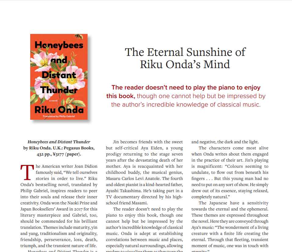
My review of ‘Honeybees and Distant Thunder’ by Riku Onda is on page 114. Here’s a snippet of that review:


Review of “Nerikomi: The Art of Colored Clay” by Thomas Hoadley

Thomas Hoadley, born in North Adams, Massachusetts, and raised in New Hampshire, graduated from Amherst College in 1971 with a BA in studio arts. After a brief foray into architecture and extensive European travel, he settled in southern Vermont with his wife, apprenticing with potter Malcolm Wright in the karatsu style of wood-fired pottery. Hoadley later earned a Master of Science in Ceramics at Illinois State University, establishing his pottery studio in the Berkshires.

His coloured porcelain art pottery, created using the Japanese nerikomi technique, is featured in public museum collections such as the Museum of Fine Arts – Boston, the Museum of Fine Arts Philadelphia, and the White House Craft Collection (now at the Clinton Library).

In his book Nerikomi: The Art of Colored Clay published by Herbert Press, Hoadley includes examples of nerikomi as well as neriage. The Japanese word “age” means “to pull up” so neriage means to pull up the mass of mixed clay that is thrown onto the wheel. Neriage refers to wheel-thrown coloured clay pottery while nerikomi refers to hand-built, often press-moulded coloured clay pottery.

Large arabesque, 2018. Height: 8 inches, width: 14 1/2 inches, depth: 8 1/4 inches (20.32 x 36.83 x 20. 96 cm) © Thomas Hoadley. Page 60.

In the image above from page 60, one can readily appreciate that Hoadley’s ceramics stand as a testament to true artistic brilliance.

Hoadley provides a fascinating and informative introduction in his book on nerikomi, explaining how the Tang Dynasty in China and the Goryeo Dynasty in Korea witnessed significant artistic achievements with marbled ware produced using two and three colours of clay, respectively. In China, the marbled ware combined white and reddish-brown clay, while in Korea, three clay colours were fired at high temperatures (p. 13). During the Song Dynasty in China (960-1279), white, brown, or black stoneware and porcelain were crafted.

The practice of using colored clay persists in regions with naturally occurring multicoloured clay. Tokoname in Japan, the oldest of the Six Ancient Kilns, exemplifies this tradition, with kilns producing various items such as teapots, bottles, and tiles as early as the Heian Period (794-1185). At its peak, Tokoname housed over 30,000 kilns (p. 23).

Hoadley explains how nerikomi, first observed in the early 1900s, was initially crafted by Kawai Kanjirō (1890-1966). By the early 1950s, Kawai ventured into creating less traditional and more sculptural ceramic shapes.

Hoadley goes on to tell the reader that in the 1970s, Yūsuke Aida (1931-2015) popularized nerikomi in a contemporary manner. Aida introduced nerikomi coffee cups in TV ads for the Nescafé Coffee Company, distributing 100 cups to the first 100 callers and swiftly bringing attention to this unique pottery technique.

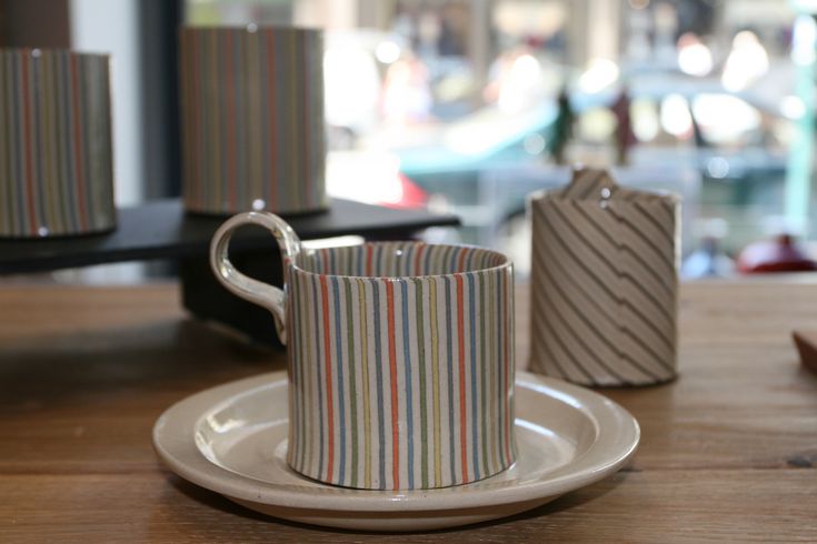
Coffee cups by © Yūsuke Aida, were made using the nerikomi method. 

JAPANESE MASTERS

The “Japanese Masters” section in Hoadley’s book, starts on page 25 and showcases five Japanese artists who have dedicated their life’s work to the art of nerikomi or neriage, presenting stunning examples of coloured clay art. These Japanese ceramists serve as a profound source of inspiration and guidance for all the featured artists from around the world in this book.

Matsui Kōsei (1927-2003) and Itō Sekisui V (b. 1941) have earned “Living National Treasure” designation for their contributions to Japanese heritage through their exceptional work.

Kōsei’s father was a kimono maker and it seems likely Kōsei was highly influenced by the colours used in the fabrics that form obi, kimono, and obiage. His body of work offers a visually exciting array of techniques and styles. Kōsei’s dedication to the art of coloured clay has served as a direct inspiration for many contributors in this book, challenging artists to experiment and discover new ideas and methods.

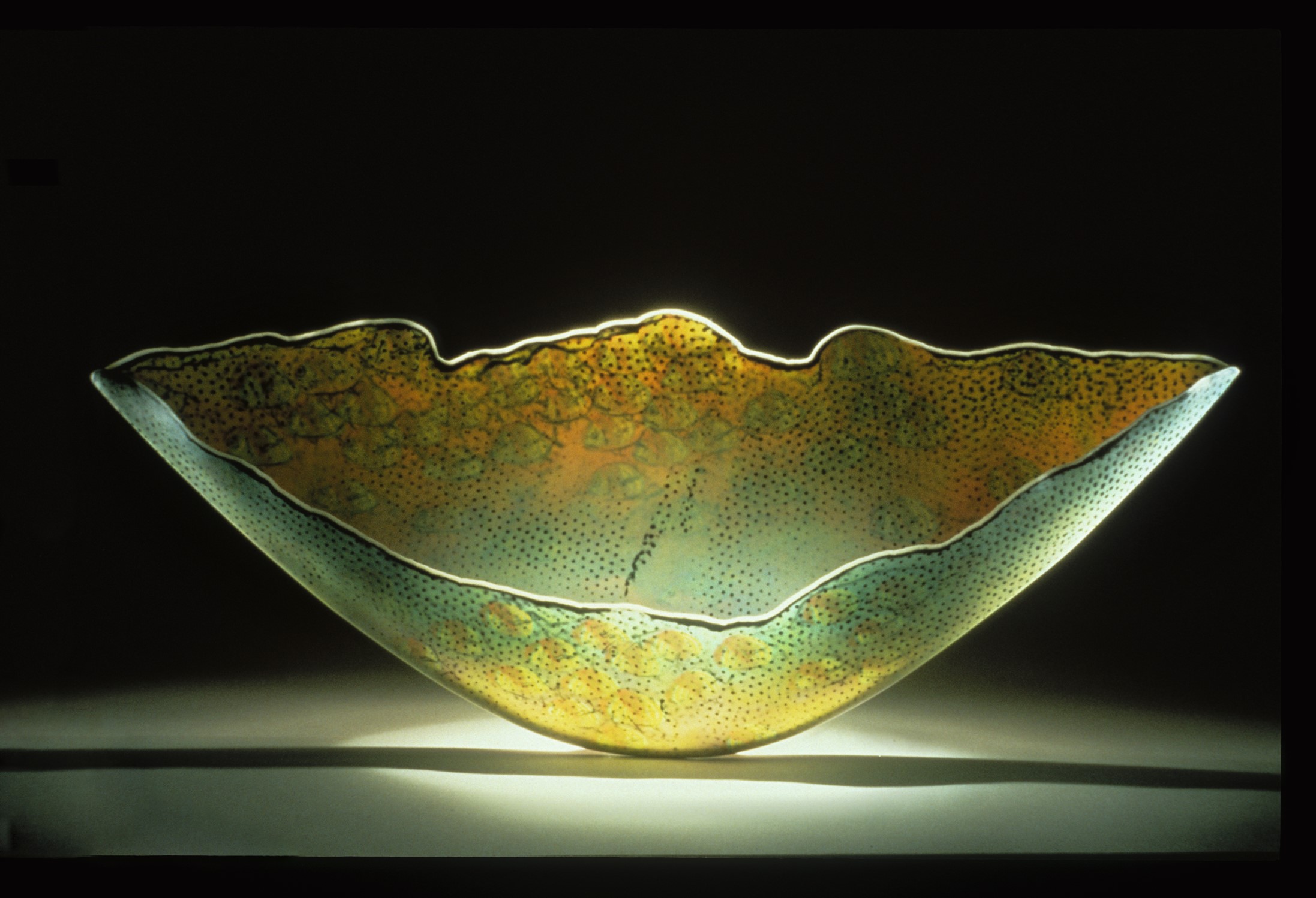
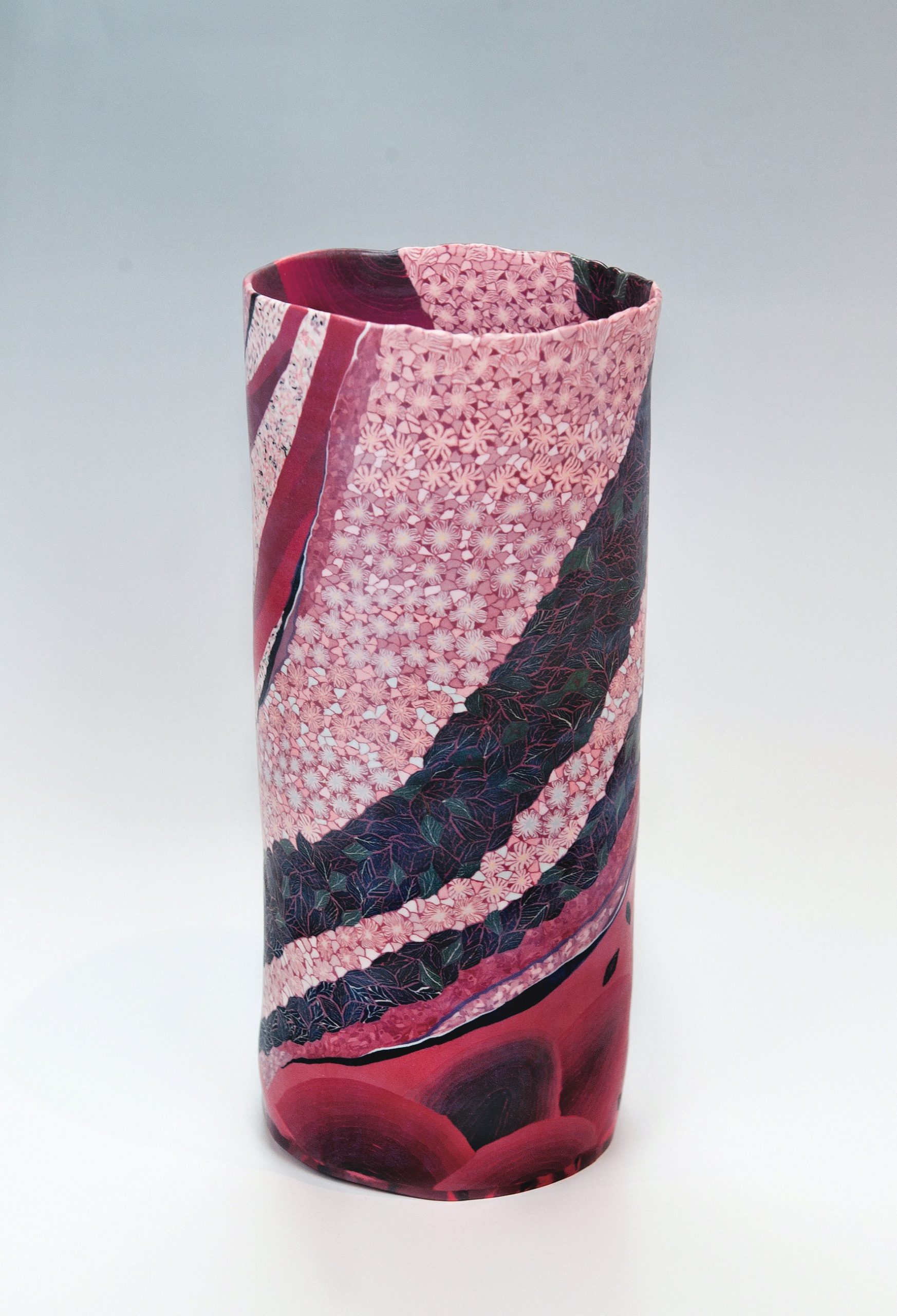
An ancestor of Itō Sekisui V relocated to Sado Island near Niigata around 1640. In 1844, the discovery of vibrant red mumyoi clay in a local gold mine became significant. Sekisui utilizes the nerikomi method, blending red mumyoi clay with local yellow firing clay, creating stunning cascades of flower petals and blossoms against a black backdrop. As seen in the image below from page 32.

Square jar with flower patterns, stoneware, 2016. Height: 9 7/8 inches, width: 5 1/2 inches, depth: 5 1/2 inches (25 x 13 x 13) Image: © Itō Sekisui V

Square jar with flower patterns, stoneware, 2016. Height: 9 7/8 inches, width: 5 1/2 inches, depth: 5 1/2 inches (25 x 13 x 13) Image: © Itō Sekisui V. Page 32.

Ogata Kamio (1949 – 2022) specializes in wheel-thrown neriage, combining neriage and nerikomi techniques. He intricately layers paper-thin sheets of coloured clays, producing subtle colour graduations.  He likes to work with greys, teal, and off-whites. Kamio’s artistic pursuit focuses on infusing “motion” into nerikomi designs, aiming to convey more than delicacy and refinement. His work seeks to bring heightened emotion and feeling to the art of nerikomi (p.35).

Kondō Takahiro (b. 1958), born into a renowned ceramics family in Kyoto, employs coloured clay among various other techniques for crafting traditional ceramic forms and sculptures. Despite initially pursuing a literature degree at Hosei University, he returned to his roots at 26, delving into wheel throwing and glazing. After apprenticing under his father’s expertise in the art of sometsuke, he expanded his exploration into other styles. In 1990, his debut exhibition marked the beginning of international recognition. Over time, he developed the gintekisai glaze, which he dubs “water born of fire.” Embracing water in its various physical forms — rain, ice, steam, and mist — his work embodies the “utsuroi no bigaku” or the art of impermanence. Kondō aims to evoke the beauty found in the ephemeral, illustrating the cycle of nature, purification, and rebirth. An example of his work can be found in the image below from page 43.

Ginteki wan nami (Wave Tea Bowl with Silver Mist Glaze), 2020. Height: 3 3/4 inches, diameter: 4 3/4 inches (9.5 x 12 cm). Rounded tea bowl in black, grey, and white marbleized clay with gintekisai (silver mist) overglaze and hand-brushed cobalt glaze decoration. Marbleized porcelain. Image: Joan B Mirviss Gallery Ltd © Richard Goodbody, Kondō Takahiro Page 43.

Born in Gifu in 1948, Nishi Koichi (b. 1948) is recognized for his mastery of coloured clay, particularly his intricate pattern-making. Renowned for his precision, he adds surface textures that lend a captivating level of mystery to his work (p. 25). Koichi employs subtle colour variations in repeated geometric designs, showcasing remarkable attention to detail. Notably, he achieves a distinctive pebbly texture using a spoon.

COLOURED CLAY WORLDWIDE

In the “Colored Clay Worldwide” section, Hoadley introduces 26 incredibly talented ceramists from all over the world. While it’s impossible to feature all of them in this blog post, let’s explore 12 artists who caught my attention:

Hans Munck Andersen from Denmark uses brightly coloured porcelain, rolling out long coils twisted together for a “candy cane” effect, as seen in the images below featured on page 67 and page 69.

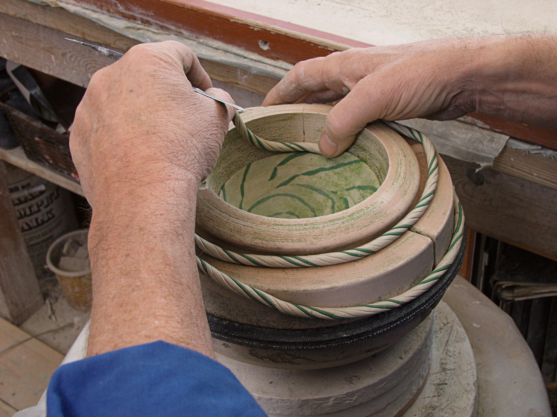
Building up a bowl inside a plaster mold. © Hans Munck Andersen. Page 69.

Sea Conch, 1985. Height: 6 1/2 inches, diameter: 8 1/2 inches (16 x 21 cm) © Hans Munck Andersen. HMA Polychrome porcelain bowl. Page 67.

Janny Baek born in South Korea and raised in Queens, New York, creates organic forms in vibrant colours. Baek says, “From my experience working in animation and toys, I bring an interest in the playful, imaginary, and sci-fi, and my experience in architecture has trained me in materiality and design.” (page 70).

Curtis Benzle from the USA, originally explored the colour dynamics of glass, but he transitioned to ceramics. He produces fragile porcelain vessels and embraces the Japanese kintsugi tradition by filling cracks with gold. An image of his work can be found below and at the top of page 75.

Migration, 1986. Height: 8 2/3 inches, width: 17 1/3 inches, diameter: 4 inches (22 x 44 x 10 cm) © Curtis Benzle. Page 75.

For Angela Burkhardt-Guallini from Switzerland, the specific type of porcelain clay is paramount. After winning a Bronze Award in the ceramics competition in Mino, Japan, she discovered a porcelain body from Seto, Japan, known for its pure white colour and beautiful shining surface. Developing an admirable artistry, her work is showcased in the image below and at the top of page 80.

Line to Line #1, 2018. Height: 5 1/2 inches, width: 10 3/5 inches, depth: 10 3/5 inches (13 x 27 x 27 cm) © Angela Burkhardt-Guallini. Page 80.

Ben Davies, a professional cellist hailing from England, has found that working with soft clay provides therapeutic benefits for hands fatigued from extended cello playing. Drawing inspiration from his academic background in Geography and Geology, his ceramic creations reflect the intricate beauty of geology and landscapes.

Barbara Gittings, with a background in fashion and design, built a successful career in the fashion industry spanning both South Africa and the UK. She has now transitioned to a full-time focus on ceramics in London, channeling her creative energy into this expressive medium. She is drawn to “irregular repetition, primitive mark-making, and soft, earthy colours.” (page 103).

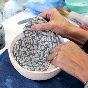
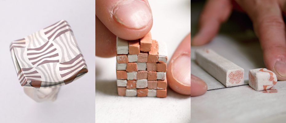
Part of Barbara Gitting’s nerikomi process: “I place the slabs into the mold, joining the beveled edges with slip as I go, cutting away the excess. Sometimes I leave space to add a different patterned rim.” (page 107).

Dorothy Feibleman has given lectures, and demonstrations, and taught on an international level. She was born in the United States but she has lived and worked in England and Japan. Feibleman has an interest in combining nerikomi with jewelry. Her innovative work includes a necklace that is on display in the Victoria and Albert Museum collection. Feibleman has also received two tool and process patents for extruders, making almost limitless nerikomi imaging for tiles, tableware, and objects. She currently collaborates with or has designed products for Noritake, Wedgwood, Herend, and Kohler. She also developed a porcelain clay body for Pottery Crafts England. You can see an example of Feibleman’s work in the image below from page 97.

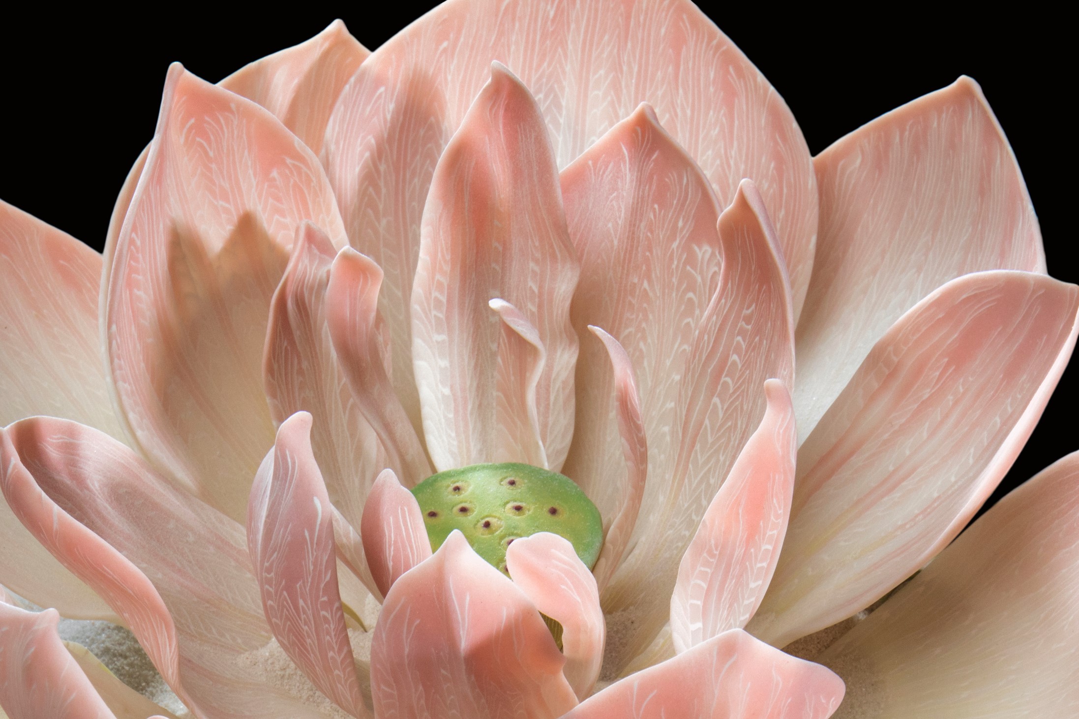
Detail of Desert Lotus, 2006. Total installation size: height: 23 2/3 inches, diameter: 59 inches (60 x 150 cm) Hand construction: laminated graduations of two different porcelains. Image: © Dorothy Feibleman; photo by Ken Yanoviak. Page 97.

Robert Hessler, who studied at the School of Visual Arts in New York, specializes in vertical vase forms and crystalline glaze work. He’s consistently pushing boundaries. Despite a relatively short period working with clay, he has an impressive body of work.

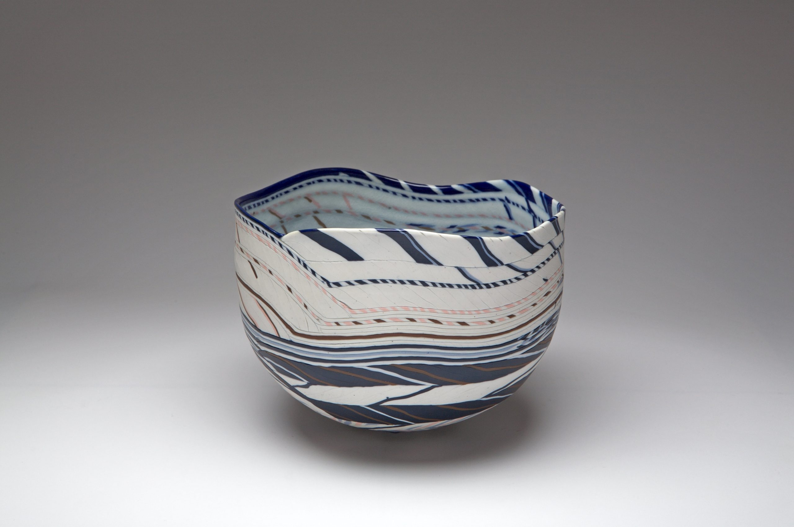
In a brief period, Narumi Ii from Australia who was born in Japan has made a remarkable impact on the ceramics world. Inspired by a chance encounter with a friend in 2016, she enrolled in a pottery class, discovering a natural affinity for clay. Self-taught in the basics of nerikomi, she has elevated the technique by painting intricate multicoloured designs onto ceramic forms, utilizing up to 200 different colours. See the image below of her vase from page 119.

Somewhere in my Dream, 2018. Height: 12 1/2 inches, diameter: 5 3/4 inches (32 x 14.5 cm) © Narumi Ii. Page 119.

After a successful career in design and printing, Judy McKenzie from England made a radical decision at the age of 57 to pursue a passion for three-dimensional Craft and Design at Havering College in London. She went on to obtain her Master’s Degree at the Royal College of Art, where she was introduced to the world of coloured clay. To address the common issue of cracking in nerikomi, McKenzie also embraces the Japanese art of kintsugi, accentuating porcelain tears with gold or silver leaf. Featured below is her work “Pink Cloud” from page 131.

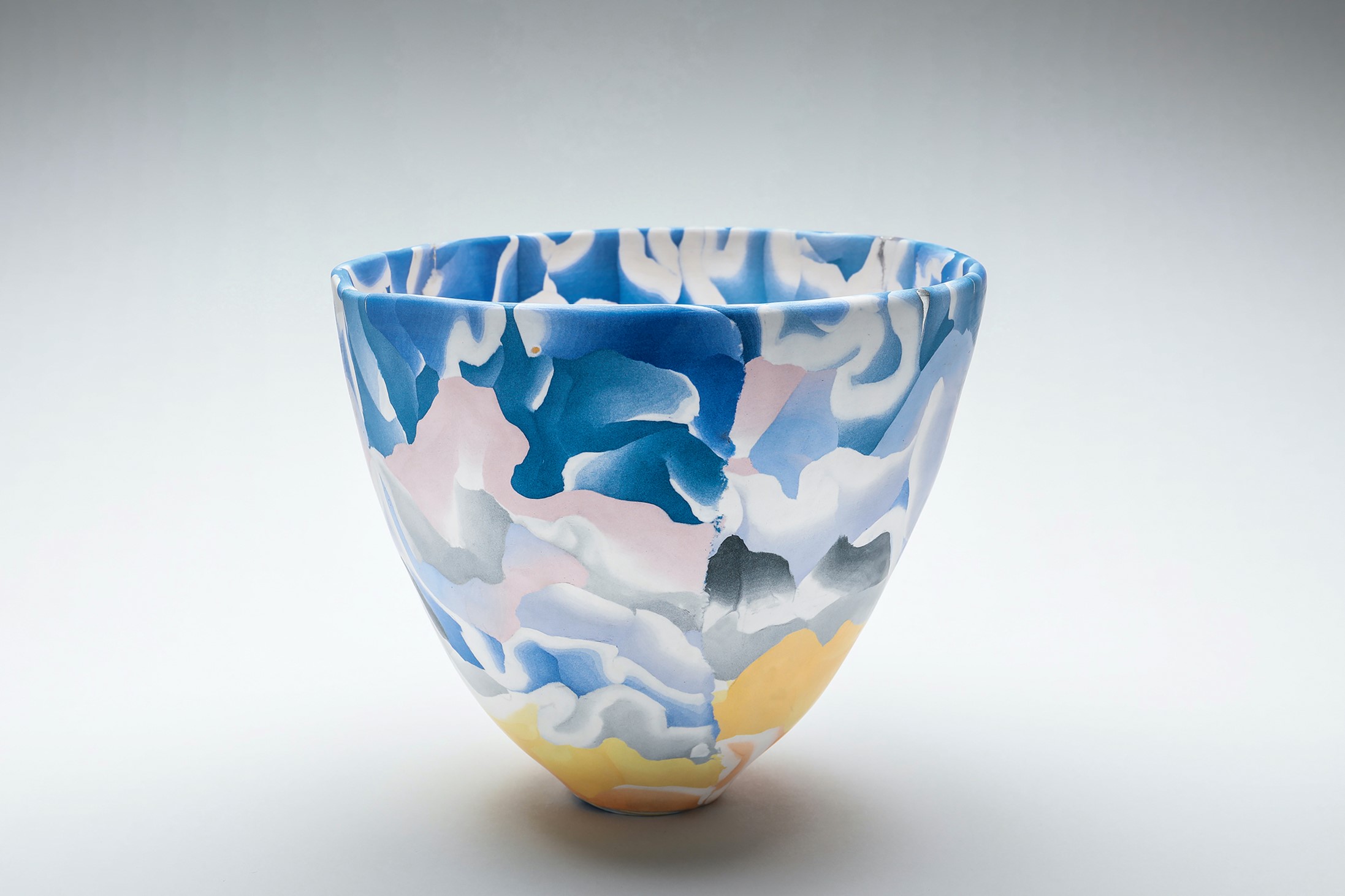
Pink Cloud, 2020. Height: 6 1/3 inches, diameter: 4 3/4 inches (16 x 12 cm). © Judy McKenzie. Page 131.

Anne Mossman joined the ceramics program at the Australian National University in Canberra after a career in management. While studying, she had the opportunity to learn from visiting artist Dorothy Feibleman, sparking her passion for ceramics. Mossman now incorporates paper into her clay to reduce cracking, and her unglazed, high-fired vessels showcase clean cylindrical forms that evoke a natural and bark-like aesthetic. You can see an example of Mossman’s work in the image below and on page 136 of the book.

Seams of Bold, 2021.Height: 11 4/5 inches, width: 6 inches, length: 7 1/2 inches (30 x 15 x 19 cm). © Anne Mossman. Page 137.

In his conclusion, Hoadley explains that while the Japanese terms ‘nerikomi’ and ‘neriage’ may have simple definitions, the artists in this collection showcase the extraordinary diversity these basic concepts can take. Each artist, guided by their inspiration, reimagines and expresses these techniques with distinctive creativity.

Larissa Warren relocated her family and ceramic studio to Tamborine Mountain, nestled in the picturesque Scenic Rim region of Queensland, several years ago. Renowned for its vibrant pottery tradition, particularly among women artisans since the 1940s, this area sparked Warren’s deep curiosity. Undertaking an extensive research endeavor, she delved into the locality’s historical legacy and embarked on a quest to unearth forgotten clay deposits and subsequent techniques.

As an artist, Warren is committed to treading lightly on the land, honouring the ancestral heritage of the Wangerriburra people with reverence and respect. Armed with a Bachelor of Fine Arts from the Queensland College of Art and a Bachelor of Arts in Art & History from Griffin University, she brings over two decades of experience as a certified Art and Media educator. Her work can be viewed from page 163 and in the image below.

Black-and-white vases from "Layers of Place" exhibition, 2020. Height: 4 1/2 inches, width: 4 1/2 inches (11 x 11 cm)

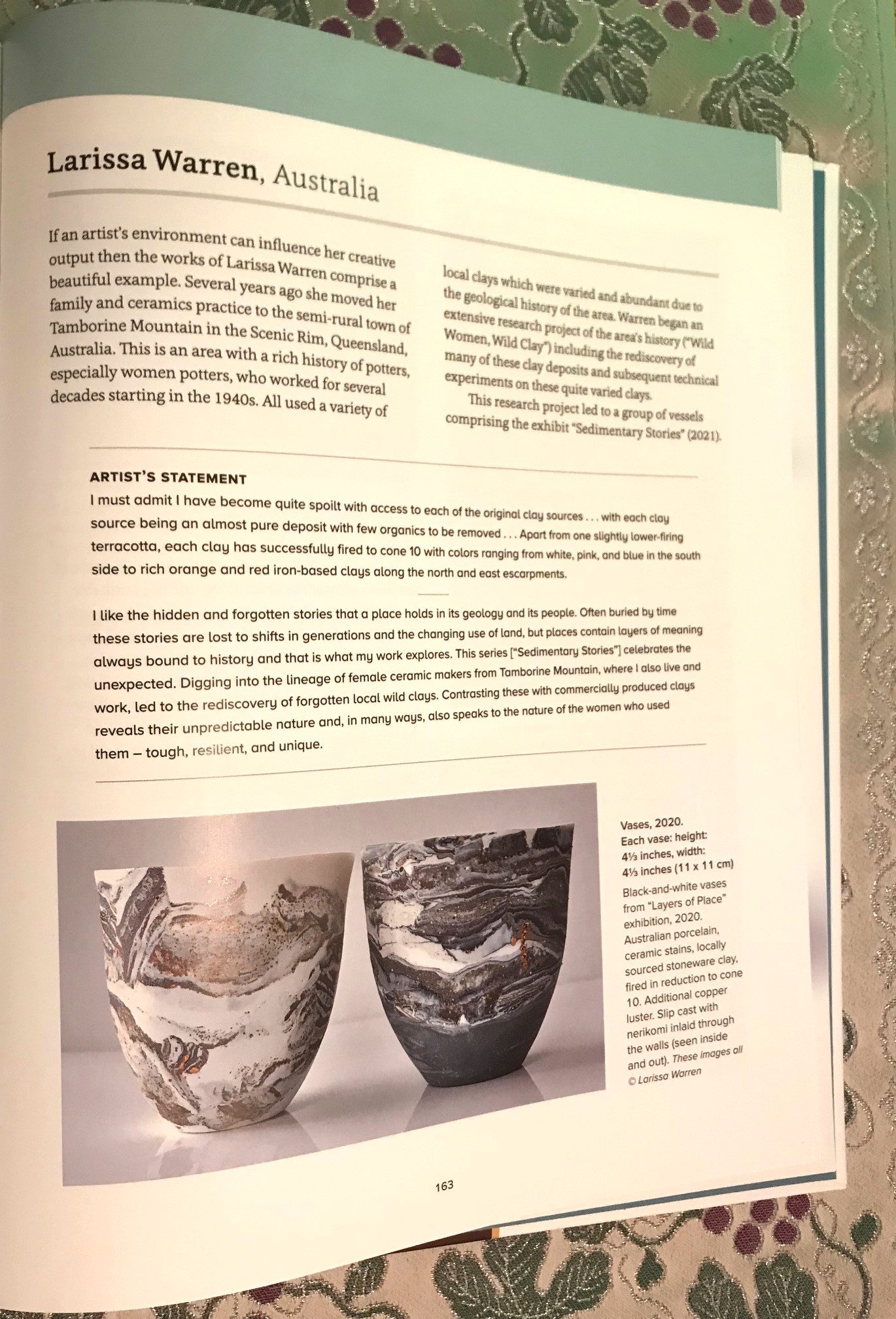
Black-and-white vases from “Layers of Place” exhibition, 2020. Height: 4 1/2 inches, width: 4 1/2 inches (11 x 11 cm)

I’d like to thank Elle Chilvers, the Senior Marketing Executive at Bloomsbury, for sending me a review copy of this beautiful book.

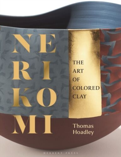
“Nerikomi: The Art of Colored Clay” by Thomas Hoadley, ISBN-13: 978-1789941692, 160 pages, Herbert Press (18 Jan. 2024), hardcover £30.00.

All images are copyright © 2024 Bloomsbury Publishing, Thomas Hoadley, Herbert Press.

If you’re interested in learning the art of nerikomi in Tokyo, Japan you can take a Nerikomi Certification Course, sponsored by Aida Chemical Industries Co., Ltd.

Review of ‘Borrowed Landscapes: China and Japan in the Historic Homes and Gardens of Britain and Ireland’ by Emile de Bruijn

After graduating from Monash University with a major in Japanese language and culture, my enduring fascination with Japan has led me to numerous personal and professional engagements in Tokyo, Melbourne, and the UK. Two decades ago, upon returning to England, a fresh passion emerged — one that involved exploring historic stately homes. This newfound pursuit has taken me across the country, allowing me to appreciate their grand architecture, refined furnishings, captivating artworks, and meticulously manicured gardens. Therefore, it brought me immense pleasure and enthusiasm to read and review the pages of Borrowed Landscapes: China and Japan in the Historic Homes and Gardens of Britain and Ireland‘ by Emile de Bruijn.

This mind-nourishing, exquisitely crafted book delves into the artistic elements borrowed from China and Japan that grace British and Irish houses and gardens, aiming to scrutinize the patterns and mechanisms they unveil. In this blog post, I’ll explore some of the key highlights, bearing in mind the content and stunning images provided here offer only a glimpse of what can be found within the work itself. This extraordinary book, published in association with the National Trust, is a wonderful read and a splendid addition to anyone’s coffee table, be it at home or in an office.

I’d like to express my gratitude to Elle Chilvers, Senior Marketing Executive at Bloomsbury Publishing, as well as Philip Wilson Publishers, and the National Trust for sending me the book and generously permitting me to use the captivating images showcased in this blog post, which are even more splendid within the pages of the book.

A PATTERN EMERGES 1600-1690

Emile de Bruijn, the author, skillfully establishes the narrative tone in the opening pages telling the reader how Marco Polo in the 13th century returned to Italy brimming with enthusiasm; vividly recounting the silk, pearl, and porcelain trade he found in East Asia. Fast forward to around 1600, the Dutch and the British established ‘East India’ trade companies, embarking on a venture to import coveted luxury items. Nevertheless, the cultural significance and integrity of these items were frequently misconstrued and overlooked (p. 10, 11).

De Bruijn goes on to explain how many Asian objects have undergone a redesign to align with European tastes in the past 400 years, with European designers emulating Chinese and Japanese objets d’art. Integrating an Asian stylistic touch, they augmented Asian porcelain and lacquer with precious metals, and reconfigured Asian furniture by dismantling and adding elements, transforming the once ‘exotic’ into something ‘domesticated’ for the European market. Western entrepreneurs, functioning as ‘gatekeepers,’ ordered substantial quantities of specific items from Asia, shaping how Europeans perceived the continent. Renowned cabinet-makers like Thomas Chippendale (1718 – 1779) further refined and marketed their own lines of orientalist furniture (p. 13).

In the 19th century, De Bruijn tells us the Prince Regent (later King George IV) embraced the Chinese ‘style’ to adorn Carlton House, the Royal Pavilion, and the Fishing Temple at Virginia Water. However, a considerable disparity exists between this stylized representation and the authentic culture of Japan and China it seeks to emulate (p. 14). The author notes on page 14 that “Asian objects were copied and adapted with insouciant abandon” during the 17th, 18th, and 19th centuries. Despite the divergence from reality, one can at least appreciate the creative ingenuity of these designers.

In the early seventeenth century, the popularity of blue and white Chinese porcelain, known as Kraak-ware, soared as it was shipped by the East India Companies in England and the Dutch Republic (p. 17) (see image 1. page. 18). The cobalt used to craft the distinctive blue pigment originated from the Middle East and was subsequently exported back to the region, facilitating a global cycle of production and consumption.

1. (Image from page 18, FIG. 1). Porcelain dish with blue and white decoration in the ‘kraak’ style, with auspicious motifs within panels around the rim and an image of birds next to a stream in the centre, probably made in Jingdezhen, Jiangxi province, China, late sixteenth or early seventeenth century, diameter 36.8 cm © National Trust/Robert Thrift


Shimmer and sheen played pivotal roles in shaping European appreciation for Japanese lacquer. (p. 20). From around 1580, the Portuguese initiated the flow of lacquer from Japan to Europe. These initial lacquer imports featured inlays of metal foil and mother-of-pearl; a technique honed by the Kōami family of artisans in Miyako (present-day Kyoto) (pg. 20). The tray in image 2. page. 20, crafted in the style of the Kanō school of painting, showcases lions in the centre, symbolising power and protection. The Japanese referred to this style as ‘namban‘ or ‘southern barbarian,’ which was influenced by traders or missionaries from Europe.2.page 20, FIG. 3 Lacquer tray in a lobed leaf or flower shape and decorated in namban style with gold and mother-of- pearl on black, the central panel showing a pair of lions under a tree, Japan, c.1600, 32 x 37 cm © National Trust Images/Dara McGrath

2. (Image from page 20, FIG. 3). Lacquer tray in a lobed leaf or flower shape and decorated in namban style with gold and mother-of-pearl on black, the central panel showing a pair of lions under a tree, Japan, c.1600, 32 x 37 cm © National Trust Images/Dara McGrath

The white porcelain figure, depicted in the image on page 25, exemplifies a representation of the Bodhisattva Guanyin. Originating from Dehua in the Fujian province of China, this particular piece dates back to the period between 1640 and 1690. Notably, it gained popularity in the refined interiors of elite British households during the late seventeenth century. Concurrently, there was a surge in the popularity of Indian gowns and Japanese silk kimono within the Dutch Republic (p. 25).

The author points out how the emergence of orientalism in English silver, decorative paper, and tapestries began to unfold during the 1680s and 1690s.

EMBLEMS OF INSPIRATION 1690-1735

De Bruijn explains how during the mid-seventeenth century, the interruption of Chinese production due to the Manchu invasion and the establishment of the Qing dynasty prompted Dutch merchants to redirect their attention to Arita in Kyushu, Japan. Among the Europeans, only Dutch merchants were granted permission to engage in trade with the Japanese. It was during this period, in the late 1670s, that a distinctive type of porcelain named Kakiemon emerged. Characterized by its fine white porcelain and a colourless glaze, Kakiemon was adorned with vibrant red, green, blue, and yellow enamels.

The Chinese lacquer folding screen in image 3. page 72 at Osterley Park in west London is stunning. During this period, China was widely regarded as an advanced civilization, and this particular screen, probably crafted in Guangzhou (Canton) between 1715 and 1720, exemplifies the opulence associated with the time. It was commissioned, in all likelihood, by a member of the Child banking family, potentially Robert Child — an influential figure as a director and chairman of the English East India Company. According to de Bruijn on page 136, members of the Child family had been investors in and directors of the East India Company for three generations. The author tells us this family had added an impressive array of Chinese and Japanese luxury goods to the family’s collections at the time of Robert Child’s death in 1782.

3. page 72, FIG. 45 Eight-fold lacquer screen decorated in red, gold and silver on black with scenes in and around a mansion or palace, surrounded by pictorial vignettes and representations of the Child family arms, the back with bird-and-flower scenery, probably made in Guangzhou (Canton), China, c.1715–20, 275 x 370 cm © National Trust Images/John Hammond


3. (Image from page 72, FIG. 45) Eight-fold lacquer screen decorated in red, gold and silver on black with scenes in and around a mansion or palace, surrounded by pictorial vignettes and representations of the Child family arms, the back with bird-and-flower scenery, probably made in Guangzhou (Canton), China, c.1715–20, 275 x 370 cm © National Trust Images/John Hammond

PEAK CHINOISERIE 1735 – 1760

The word ‘chinoiserie‘ is the term denoting the imitation-Chinese style. During the mid-eighteenth century, Chinese-style garden structures reached the pinnacle of fashion. The era witnessed a widespread emulation of Chinese materials and shapes, and the importation of Chinese luxury products, influenced in part by European taste. Notable examples also include painted enamel, famille rose porcelain, wallpaper, mirror paintings, and miniature pagodas (p. 81).

Two bureaux featuring dressing mirrors at Powis Castle in Wales, one depicted in image 4. page 80, are believed to have been commissioned in England and manufactured in China. However, de Bruijn explains there’s an interesting twist to this hybrid creation because they were sent to Japan for the addition of lacquer. This serves as a noteworthy example of fully hybrid yet prestigious orientalist objects from the 18th century. The absence of mirrors added by the Japanese, replaced instead by scenes of waterfalls, underscores the intriguing lack of cross-cultural communication during this period.

4. page 80, FIG. 53 Tabletop bureau surmounted by a dressing mirror frame, one of a pair, probably made in Guangzhou, China, and lacquered in Japan, c.1730–50, on a later stand, 174 x 80.5 x 50 cm © National Trust Images/Leah Band

4. (Image from page 80, FIG. 53). Tabletop bureau surmounted by a dressing mirror frame, one of a pair, probably made in Guangzhou, China, and lacquered in Japan, c.1730–50, on a later stand, 174 x 80.5 x 50 cm © National Trust Images/Leah Band

Paraphernalia for preparing tea had been associated with China ever since the beverage had been introduced to Europe in the early seventeenth century. Tea was originally drunk as a medicine for headaches, fatigue, and digestion problems but later became an everyday drink for the wealthy. From the 1670s, stoneware teapots from Yixing in Jiangsu province were exported to Europe. Chinese pictorial wallpaper also became popular in the 1740s. The Little Parlour at Uppark was decorated with Chinese wallpaper and serving tea in this room was considered the ultimate display of femininity.

FICTIONS HAVE THEIR OWN LOGIC 1760-1780

In the face of William Chambers’ endeavours to “quell the extravagancies of chinoiserie” during the mid-eighteenth century, the overdoor shaped like a Chinese-style pavilion in the Chinese Room at Claydon House in Buckinghamshire by Luke Lighthouse as depicted in image 5. page 120, stands as “another unashamedly extravagant example of British orientalist design” (p. 121). De Bruijn says this portrayal is described as “completely divorced from the reality of China.”

5. page, 120, FIG. 85 Octagonal porcelain covered jar in a baluster shape, decorated in the famille rose palette, the lid with a lion finial, one of a pair, made in Jingdezhen, China, c.1735–45, 95.5 cm high, on wooden English- made stands © National Trust Images/Andreas von Einsiedel

5. (Image from page. 120, FIG. 85). Octagonal porcelain covered jar in a baluster shape, decorated in the famille rose palette, the lid with a lion finial, one of a pair, made in Jingdezhen, China, c.1735–45, 95.5 cm high, on wooden English-made stands © National Trust Images/Andreas von Einsiedel

In contrast to the exuberance evident in Lightfoot’s efforts, Thomas Chippendale’s approach appears notably genteel, as exemplified by the pier glass shown on page 133. It’s worth buying the book to see this one.

COMPETING PERSPECTIVES 1780-1870

Page 139 details how, towards the close of the 18th century and the inception of the 19th century, a shift occurred in European perspectives. Their own values and viewpoints came to the forefront, leading to a reversal where the history, society, governing structures, and artistic traditions of Japan and China were now perceived as “signs of inertia, backwardness, repetitiveness, and a mechanical mindset”.

As the First Opium War unfolded (1839-42) between Britain and China, Chinese wallpapers, retained their place of prominence in prestigious British homes. These once deemed ‘exotic’ products had seamlessly integrated into British material culture, thoroughly ‘domesticated’ and expected in elite interior decoration (p. 160). In contrast, European materials and techniques had become ingrained in Guangzhou during this period.

De Bruijn tells us that Owen Jones was one of a few architects and designers who wanted to “identify and expound on the ‘eternal principles’ of good design”. He also mentions how many ‘truly magnificent works of Ornamental Art’ from China to Britain at this time were caused by the destruction of public buildings during the Opium War (1856-60) and the British looting of the Yuanmingyuan Palace complex in Beijing (p.167).

THE AGE OF JAPONISME 1870 – 1900

De Bruijn starts this section by explaining from the early 17th century to the mid-19th century, exclusive trading privileges with Japan were confined to the Dutch and the Chinese, meticulously regulated by the Tokugawa shogunate, the country’s military leaders. In a pivotal turn of events in 1853, the US Navy, under the command of Commodore Matthew C. Perry, arrived off the coast of Edo (modern-day Tokyo). Employing warships, Perry exerted pressure on Japan to open its ports to international trade. This exertion led to the establishment of a new government headed by the Meiji Emperor in 1868. In response, Japan initiated an ambitious program of modernization and industrialization, strategically maximizing exports.

Europe experienced a surge in substantial quantities of Japanese fine and decorative art, a phenomenon that French collector Philippe Burty aptly termed ‘Japonisme’ in 1872. During this period, there was a perceptible shift as the demand for Chinese objects waned, and Japanese items were embraced as both ‘new’ and more authentically appealing.

Famous woodblock prints like this one by Utagawa Hiroshige in image 6. page 171 were viewed “in the realm of tranquillity, beauty and art” (p. 170).

6. page 171, FIG. 120 Utagawa Hiroshige, Koganei, Musashi Province (Musashi Koganei), woodblock print, part of an album of prints entitled Thirty-six Views of Mount Fuji (Fuji sanjūrokkei), published by Tsutaya Kichizō, Edo (present-day Tokyo), Japan, 1858, 36 x 24 cm © National Trust Images/Leah Band

6. (Image from page 171, FIG. 120). Utagawa Hiroshige, Koganei, Musashi Province (Musashi Koganei), woodblock print, part of an album of prints entitled Thirty-six Views of Mount Fuji (Fuji sanjūrokkei), published by Tsutaya Kichizō, Edo (present-day Tokyo), Japan, 1858, 36 x 24 cm © National Trust Images/Leah Band

We learn that in 1862, Sir John Rutherford Alcock, the British Consul-General to Japan, presented a collection encompassing “prints, books, bronzes, porcelain, lacquer, and enamel” at the 1862 International Exhibition in London. This exhibition played a pivotal role in stimulating heightened demand for Japanese goods among the British public (p. 170).

In 1878, a law in Japan prohibited the public wearing of swords, yet the sustained interest from the West facilitated the continuation of swordcraft by artisans, catering to European and American interiors (p. 178). This extended not only to the skilled metalworkers but also to the reproduction of religious iconography, ensuring that motifs and symbols were preserved and not lost to posterity.

This Japanese cabinet from image 7. page 180 can be found at Hill Top, the Lake District home of children’s author Beatrix Potter. This style of cabinet using geometric patterning called Hakone wood mosaic was sold on the Tōkaidō highway between Edo and Miyako (modern-day Kyoto).

7. page 180, FIG. 128 Cabinet (soshoku tansu) decorated with wood mosaic (yosegi zaiku) and covered with clear lacquer, made in the Hakone area, Kanagawa Prefecture, Japan, 1870–90, 83 x 89.5 x 47 cm © National Trust/Knole Conservation Studio

7. (Image from page 180, FIG. 128). Cabinet (soshoku tansu) decorated with wood mosaic (yosegi zaiku) and covered with clear lacquer, made in the Hakone area, Kanagawa Prefecture, Japan, 1870–90, 83 x 89.5 x 47 cm © National Trust/Knole Conservation Studio

Starting from the 1870s, Japanese textile manufacturers embarked on creating exquisite products tailored to appeal to the European and American markets, particularly in the realm of ‘fine arts’. The tradition of pictorial embroidery, cultivated in Japan for centuries and reaching a pinnacle of sophistication during the Edo period (1615-1867), was a common practice found in various items like kimono, kimono sashes (obi), gift-wrapping cloths (fukusa), and textiles used in Buddhist temples. The remarkable level of expertise inherent in this art form is vividly demonstrated in a folding screen showcased in image 8. pages 196 and 197, likely crafted by the Chisō company in Kyoto.

8. pages 196 & 197, FIG. 139 Silk folding screen embroidered with birds and flowers against a black ground, possibly by the Chisō company, Kyoto, Japan, late nineteenth or early twentieth century, 170 x 244 cm © National Trust Images/Leah Band

8. (Image from pages 196 & 197, FIG. 139). Silk folding screen embroidered with birds and flowers against a black ground, possibly by the Chisō company, Kyoto, Japan, late nineteenth or early twentieth century, 170 x 244 cm © National Trust Images/Leah Band

NEW AND OLD ORIENTALISMS – The 20th century

According to de Bruijn, the British statesman George Curzon, during his tenure as Viceroy of India, amassed a significant collection of authentic Chinese artifacts. Subsequently, he generously donated many of these pieces to the Victoria and Albert Museum in London. Perceiving himself as a British imperial overlord, Curzon likely believed it was his prerogative to acquire and preserve art, including items looted from Chinese palaces, by placing them in museums.

De Bruijn tells us the late nineteenth or early twentieth-century screen showcased at Greenway in Devon, which is featured on the book cover and page 209, epitomizes Chinese ‘imperial’ taste, despite likely being a new creation. In China, such screens, known as pingfeng, served the dual purpose of wind shields while functioning as movable art. Crafted with meticulous detail, they incorporated blue and purple kingfisher feathers, ivory, coral metalwork, and a textile background.

The screen at Cragside in Northumberland, featured in image 9. page 210, serves as the Japanese counterpart to the pingfeng depicted on page 209 and the cover. Painted by Takeuchi Seihō in the Nihonga style (Japanese painting), distinct from the yōga (Western painting) style rapidly emerging in the late nineteenth century, this piece likely functioned as a gift from a high-ranking Japanese visitor during the late Victorian and Edwardian periods. De Bruijn tells us Seihō was sponsored by the Japanese government to study Western art in Europe. Seihō imbues this screen with a romantically Turneresque style, while the depiction of the deer symbolizes the essence of autumn.

9. page 210, FIG. 148 Single-panel screen (tsuitate) in red lacquer inset with a watercolour depicting a pair of deer lying in a meadow by Takeuchi Seihō, probably first quarter of the twentieth century, 37 cm high © National Trust Images/Leah Band

 9. (Image from page 210, FIG. 148). Single-panel screen (tsuitate) in red lacquer inset with a watercolour depicting a pair of deer lying in a meadow by Takeuchi Seihō, probably first quarter of the twentieth century, 37 cm high © National Trust Images/Leah Band

Persistently, there exists a “tenacity of orientalist self-referentiality, always preferring fiction over fact” (p. 237). A notable example of this phenomenon is evident in the gramophone showcased in image 10. page 231 within Lady Bearsted’s bedroom at Upton House in Warwickshire. Accompanied by Japanese prints, an imitation-lacquer bed, and a ‘pagoda’ shaped overmantel mirror, this gramophone, encased in an early 18th-century imitation lacquer cabinet, exemplifies how this trend of orientalizing also encompassed new technology (p. 232).

10. (Image from page 231, FIG. 163). Gramophone decorated in imitation red and gold lacquer, 1920s–30s, 59 x 96 x 64 cm © National Trust Images/Nadia Mackenzie

On the final pages, Bruijn summarises the book with this paragraph: “British engagement with China and Japan from about 1600 onwards triggered desire, admiration, inspiration, and imitation; it was also accompanied by appropriation, misunderstanding, dismemberment, and caricaturing.” (p. 240) British and other European commentators took on the role of presumed experts on China and Japan, positioning themselves as self-appointed gatekeepers. In this capacity, they expanded the body of knowledge while concurrently distorting it with their own priorities and preconceptions (p. 240).

Thank you for delving into one of my most extensive yet gratifying reviews to date. This book is truly enthralling, and adorned with magnificent images. It’s a valuable investment and a delightful addition to any coffee table, ideal for sharing with others.

Borrowed Landscapes: China and Japan in the Historic Homes and Gardens of Britain and Ireland‘ by Emile de Bruijn. ISBN-13: 978-1781300985, (256 pages), Philip Wilson Publishers (12 Oct. 2023), hardback £35.00.

…………………………………………………….

If you’re interested in the fusion of art and fashion within the context of China, I highly recommend “The First Monday in May” on Netflix. Starring Dame Anna Wintour, editor-in-chief of Vogue since 1988, the documentary delves into the creation of the record-breaking 2015 art exhibition “China: Through the Looking Glass” at the Metropolitan Museum of Art, curated by Andrew Bolton. This particular Costume Institute Benefit aimed to challenge the orientalist stereotypes associated with China and explore the authentic mutual exchange between China and the Western world through fashion and film.